Our Blog
Responsive Design is the method of developing a website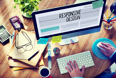 design in a manner that allows the layout and design to automatically change according to the user’s computer, tablet and smartphone screen resolution. With this method of development, you will have one site to maintain through the CMS and the full site is always available to your visitors, regardless of the type of device they are viewing the site through.
For a look that’s unique to your site, and consistent throughout it, we’ll create all the images needed for use on your site, including navigation bars or buttons, logos, headers, and all other graphics. In order to provide a visual association with your printed materials, we’ll use your organization’s colors and logo.
CU Solutions Group will develop no fewer than three (3) sets of initial design concepts for your site based on prior input. From these designs, you will select one and will be given up to three (3) sets of revisions. We will initially design the PC version of the site and once that design has been approved, we will then create the Tablet and SmartPhone versions of the site based on discussions with your credit union to determine key features and elements will need to be positioned higher in the screen for more exposure.
This is my first test posting in the new blog module. This is easy! It has an editor just like the CMS pages do.

